Deciding what to measure
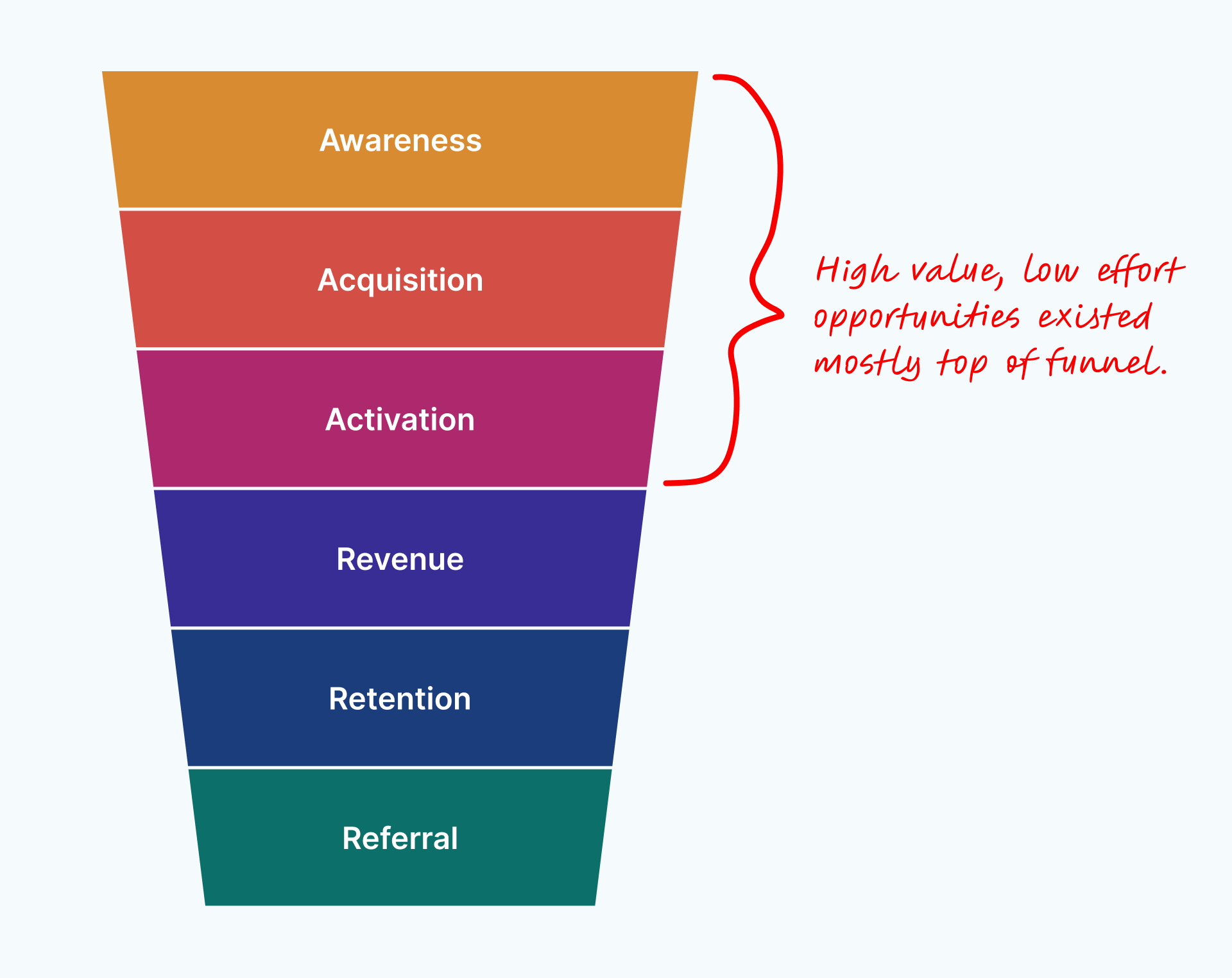
At the start of the project, we decided to use Dave McClure’s Pirate Metrics. This gave us a framework for understanding which parts of the funnel were causing the most problems for users and which metrics we might be able to effect the fastest and most easily.
Mapping the user journey
With only 3 weeks to deliver our recommendations, we decided to stay laser focused on the areas where we thought we could affect the most change.
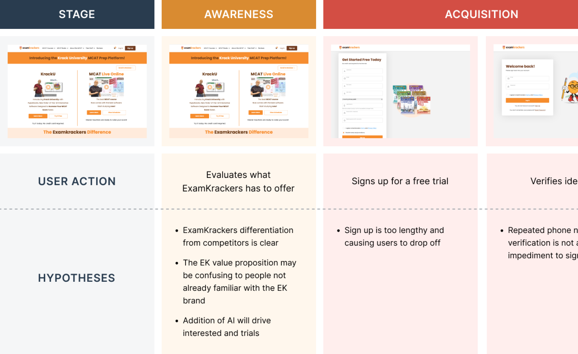
This meant limiting our mapping of the user journey to essential touch points and staying out of the weeds for features and screens that weren’t on the happy path. I mapped the core journey by each phase of our funnel along with user actions and hypotheses for each screen.
Reviewing and evaluating the existing website and platform
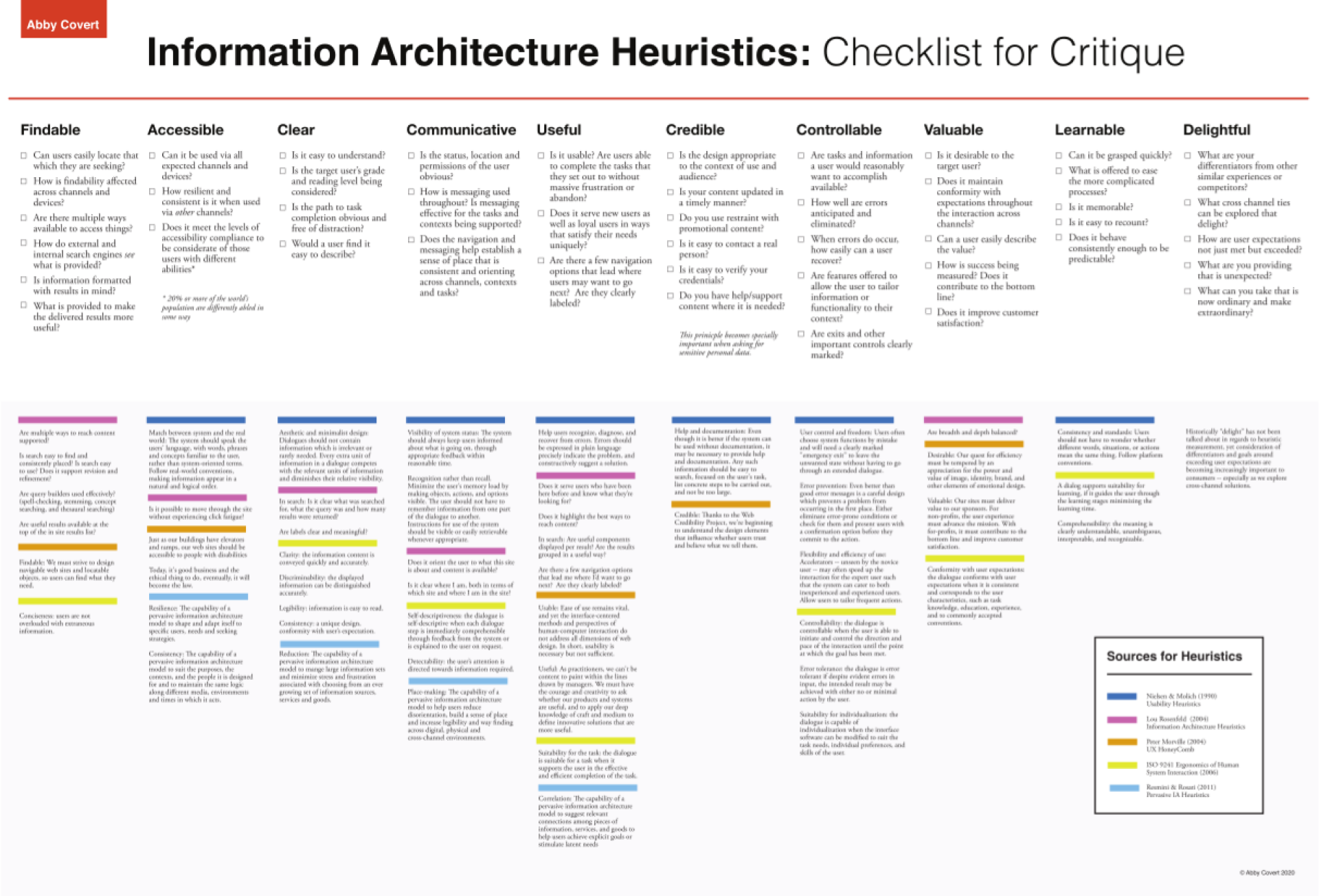
Once we had mapped key screens, I led a Design Critique Workshop with the client to understand what was and wasn’t working from their perspective. We also conducted a heuristic analysis using Abby Covert’s IA Heuristics Checklist to benchmark the website and product.
Key areas for improvement- Unclear value propositions and messaging
- Unclear CTAs and lack of direction for potential customers
- Critical usability issues in the sign up and login flows
- Lack of hierarchy and logical page organization
- Unclear concepts and labeling
- Inconsistent styling of UI controls
- Lack of signifiers for interactivity
Testing solutions with users
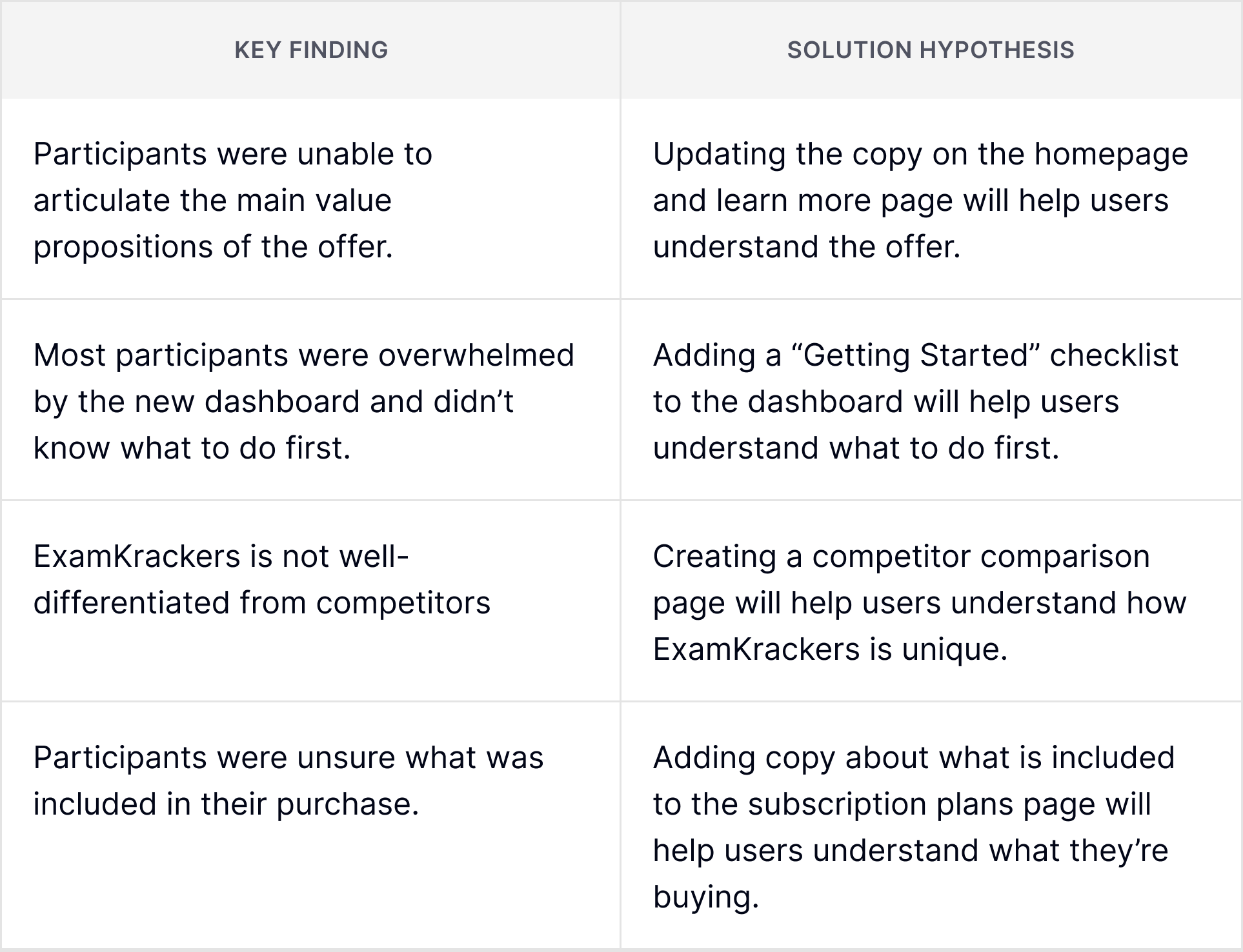
We conducted 11 user interviews over 2 rounds. Based on our findings from the first round, we created solution hypotheses and early low-fidelity screens to A/B test solutions with users during the second round.
Prioritizing the right things
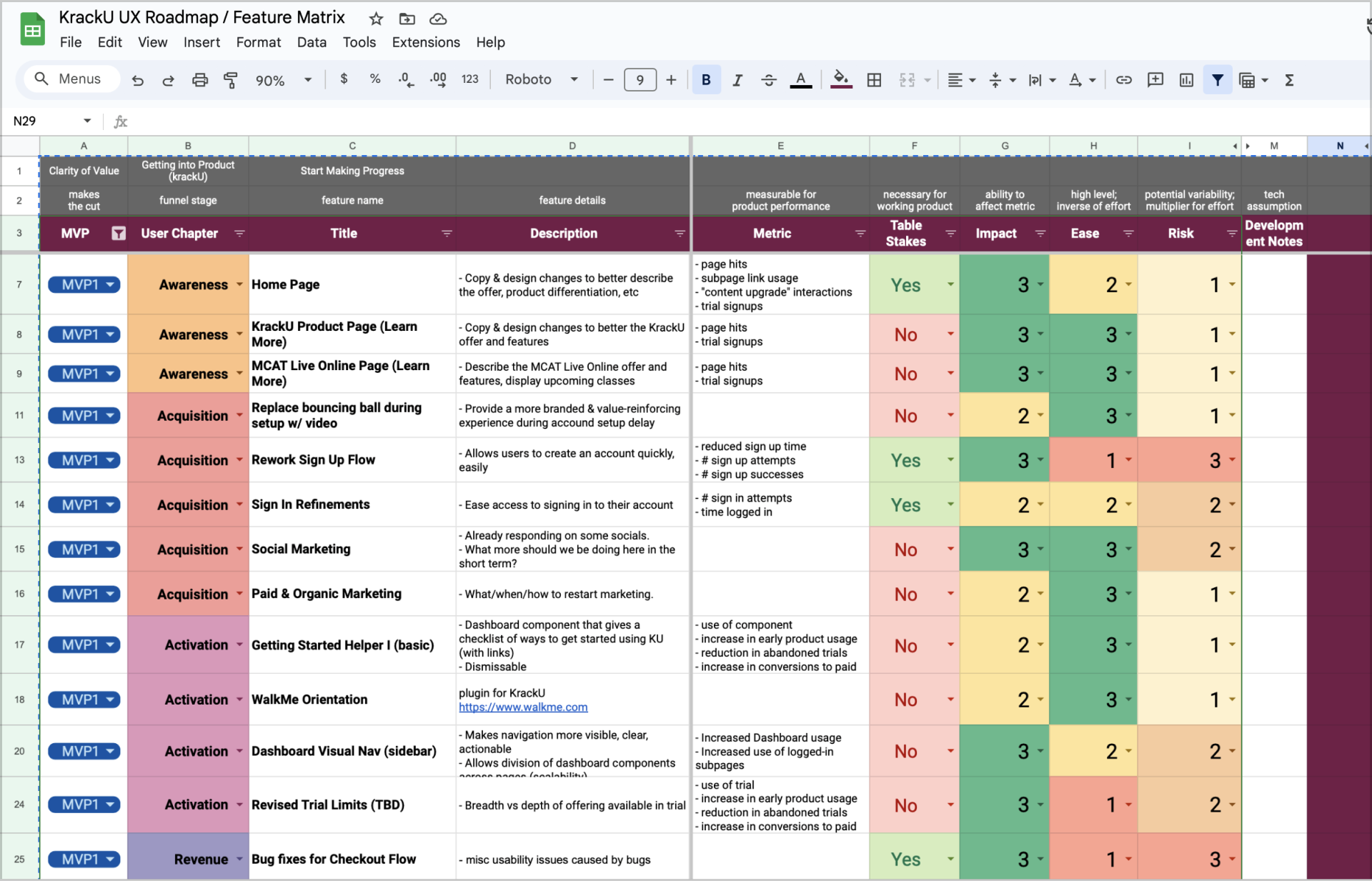
We concluded our 3 week discovery with a final readout of our findings and a proto-backlog of the issues we uncovered, prioritized by value and effort.
Opportunities with the highest ROI- Update the copy and layout on the home page and key product pages
- Rework the sign up flow and address critical usability issues
- Add a “Getting Started” checklist to the dashboard
- Improve the information architecture of the dashboard with groups and labels
- Fix technical and UX issues in checkout flow
Final outcome and takeaways
I rolled off the project and handed the lead to the talented Heather Stiles. The rest of the team is currently addressing the UX issues in the backlog and will be measuring results over the next few months.
Here are some of the things I came away with:
Focus on what matters
Three weeks is a short amount of time to do a UX discovery, but having tight time constraints forces you to ask yourself “well, what can we do?” We needed to make the most of the time we had, and ignoring everything that wasn’t absolutely essential to the user’s core experience was left intentionally unexamined. Easier said than done when you’re a UX nerd, but immensely useful for this project.
Care most about the work around the work
The full value of UX is not realized until others see what you see. The time best spent on this project was the time we spent talking about our findings, digging into questions, and working with the client to build shared understanding. None of the work matters if you don’t care enough about good communication and collaboration.